


Key Points
- Period care brand Always has launched a new outdoor advertising campaign created by PG One | Saatchi.
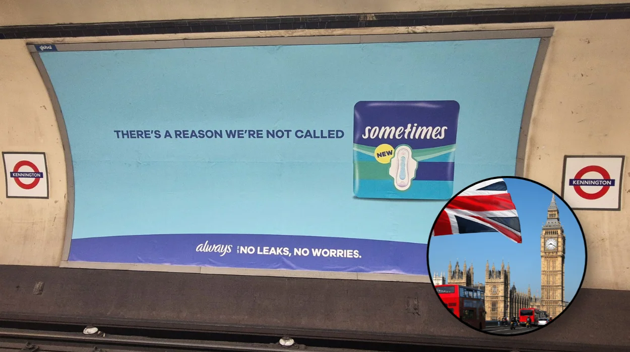
- The campaign centres on the Always name, with lines such as “Superior protection doesn’t do ‘sometimes’” allowing the brand name to complete the message.
- The ads are running across London Underground locations in static and digital out-of-home formats.
- The campaign also includes social media activity.
- Oliver Farrington, executive creative director at PG One | Saatchi, said the campaign was designed to position reliability as Always’ core point of difference.
- Nicole Hallak, brand director at P&G, said the campaign reflects the company’s promise of consistent protection to consumers.
- Glenn Smith and Aimee Marshall created the work under the executive creative direction of Oliver Farrington.
London (Britain Today News) August 28, 2026 — Period care brand Always has rolled out a new outdoor advertising campaign across London, created by agency PG One | Saatchi, which uses the brand’s own name as the punchline of its message. The campaign, appearing on London Underground static and digital sites as well as on social media, builds its central line around the idea that “superior protection doesn’t do ‘sometimes'” — leaving the brand name, Always, to finish the sentence and reinforce the promise of reliability that sits at the heart of the work.
- Key Points
- What Is The New Always Campaign About?
- Where Is The Always Campaign Being Displayed?
- Who Created The Always Campaign?
- What Does The Campaign’s Key Line Say?
- How Does The Campaign Use The Brand Name Creatively?
- Why Did PG One | Saatchi Choose Simplicity For This Campaign?
- What Did Oliver Farrington Say About The Campaign’s Purpose?
- What Did P&G’s Nicole Hallak Say About The Brand’s Reliability Promise?
- How Does The Campaign Extend Beyond Outdoor Advertising?
- What Does This Campaign Mean For Always’ Positioning In The Period Care Market?
What Is The New Always Campaign About?
The campaign is built around a simple but deliberate piece of wordplay. Rather than explicitly stating the brand name within the body copy of each execution, the posters are designed so that the reader arrives at the word “Always” themselves, prompted by lines that describe consistency and dependability. The flagship line, “Superior protection doesn’t do ‘sometimes’,” is a clear example of this approach: the copy sets up an idea of unwavering reliability, and the brand name itself becomes the implied conclusion.
This technique is not new to advertising more broadly, but it is being described by those behind the work as a way of drawing attention back to a brand asset that has arguably been sitting in plain view for years — the name “Always” itself, with its built-in connotations of permanence and consistency.
Where Is The Always Campaign Being Displayed?
According to the details shared about the rollout, the campaign is appearing across London Underground locations, taking in both static poster sites and digital out-of-home screens. This combination allows the simple copy-led executions to reach commuters across the city in a high-frequency, high-visibility environment, which is typically well suited to short, punchy lines of the kind featured in this campaign.
Beyond the Underground network, the campaign has also been extended into social media, allowing the same core idea and tone of voice to carry across into digital and mobile-first formats, where audiences are likely to encounter the brand outside of their daily commute.
Who Created The Always Campaign?
The campaign was created by the agency PG One | Saatchi. Within the agency, the creative work is credited to Glenn Smith and Aimee Marshall, with Oliver Farrington serving as executive creative director overseeing the project. The involvement of P&G, the parent company behind the Always brand, is represented through brand director Nicole Hallak, who has spoken about the strategic thinking behind the campaign’s messaging.
What Does The Campaign’s Key Line Say?
The most prominent line to emerge from the campaign so far is:
“Superior protection doesn’t do ‘sometimes’.”
This single sentence encapsulates the entire creative strategy at play. It sets up a contrast between occasional or inconsistent protection and the idea of protection that is, by implication, always present — a direct nod to the brand name itself. The line is understated in tone, relying on confidence and brevity rather than elaborate visual storytelling, in keeping with the broader minimalist approach taken across the executions.
How Does The Campaign Use The Brand Name Creatively?
At the core of this campaign is a piece of copywriting logic that effectively hands the final word to the brand itself. By writing lines that describe reliability without explicitly naming it, the creative team has structured each execution so that the reader’s own recognition of the brand name supplies the punchline. This is a technique that requires strong brand recognition to succeed, since it depends on audiences already being familiar with “Always” as a period care brand in order for the wordplay to land effectively.
Oliver Farrington, executive creative director at PG One | Saatchi, addressed this directly when discussing the thinking behind the work. As stated in an interview with LBB (Little Black Book), Farrington said:
“Always is a brand with a fantastic, rich heritage. But it’s also up against competitors old and new. We wanted to showcase our core point of difference — reliability — with a dose of simplicity, confidence and wit. Conveniently all encapsulated in the brand name.”
Why Did PG One | Saatchi Choose Simplicity For This Campaign?
The decision to strip the creative back to short, confident lines of copy appears to have been a deliberate response to a crowded competitive landscape. Farrington’s comments, shared with LBB, point to a market in which Always is contending with both established rivals and newer entrants to the period care category. Rather than attempting to communicate multiple product benefits or features within a single execution, the agency instead chose to focus on a single, simple idea — reliability — and let that idea do the work across every touchpoint of the campaign.
This kind of reductive approach, where a brand’s entire proposition is distilled into one confidently stated line, is often used in outdoor advertising specifically because of the format’s constraints. Passers-by and commuters typically have only a few seconds to absorb a poster message, meaning that clarity and brevity tend to perform better than more complex or layered messaging.
What Did Oliver Farrington Say About The Campaign’s Purpose?
Speaking to LBB about the creative rationale, Farrington reiterated that the intention was to bring “renewed focus” to one of Always’ longstanding strengths — its reliability. In doing so, he framed the campaign not as an attempt to reinvent the brand, but rather as a way of re-presenting an existing strength in a way that feels fresh, witty and confident. His remarks suggest that the creative team saw an opportunity in the brand name itself, describing it as something that conveniently encapsulated the entire message the brand wanted to convey.
This framing positions the campaign less as a dramatic repositioning exercise and more as a sharpening of an existing message — one rooted in decades of brand equity that Always has built up as a household name in the period care category.
What Did P&G’s Nicole Hallak Say About The Brand’s Reliability Promise?
Nicole Hallak, brand director at P&G, also spoke about the campaign, framing reliability as something that extends beyond the functional performance of the product itself. In comments provided to LBB, Hallak said:
“At Always, reliability isn’t just a product benefit; it’s our promise. This campaign captures that promise in its simplest form, reminding women that when life is unpredictable, their period protection shouldn’t be. We’re proud of how creatively the work brings that message to life.”
Hallak’s remarks suggest that, from P&G’s perspective, the campaign is intended to function as an emotional reassurance to consumers as much as a straightforward advertisement for a product’s protective qualities. By tying reliability to the unpredictability of everyday life, the messaging attempts to position Always as a constant that consumers can depend on, regardless of external circumstances.
Explore More about London:
Oxford Street Motorcycle Crash Leaves One Fighting for Life
Chemistry Teacher Convicted of Indecently Assaulting Two Pupils in the 1980s
How Does The Campaign Extend Beyond Outdoor Advertising?
While the primary format for the campaign is out-of-home advertising across the London Underground, the work has also been extended into social media. This suggests an intention to maintain consistency of message and tone across formats, rather than treating outdoor and digital and social channels as entirely separate creative exercises. Given that the core creative idea relies on short, punchy copy, it lends itself relatively easily to adaptation across different platforms, from static posters through to digital screens and social feeds.
The extension into social also indicates a desire to reach audiences who may not necessarily encounter the campaign during a physical commute, broadening its potential reach beyond London’s transport network alone.
What Does This Campaign Mean For Always’ Positioning In The Period Care Market?
Taken together, the comments from both Farrington and Hallak point to a campaign that is less about introducing something new to the Always brand and more about reasserting a message that has arguably always been present within it — quite literally, in the brand’s own name. In a period care market that has seen a growing number of both legacy and newer competitors, the campaign appears designed to re-anchor Always around the idea of dependable, consistent protection, using confident and economical copywriting rather than elaborate visual devices to do so.
Whether this messaging translates into a shift in consumer perception or purchasing behaviour remains to be seen, but the campaign itself represents a clear creative choice: to let a single, familiar brand name carry the weight of the entire message, rather than introducing new claims or imagery to communicate the brand’s core promise.